.png)

DoTM Rebrand & Redesign
A website redesign and rebranding for DoTM (Directorate of Tourism Maharashtra) government website
(Grad project)


-01.png)
Project Brief
The project aims to redesign Maharashtra Tourism’s branding and website to create an engaging and inclusive user-friendly platform. The tourism initiative presents Maharashtra as a complete destination by highlighting its historical background, traditional heritage, culinary specialties, urban lifestyle, natural landscapes, adventure options, and hospitable nature. At present, tourism in Maharashtra is fragmented and limited to specific destinations and events rather than presenting a composite image of Maharashtra’s cultural and geographical diversity. As the key agency driving tourism information, the Directorate of Tourism Maharashtra (DOTM) cannot afford to present a sliced out version of what Maharashtra looks like. Current digital experience falls short in keeping visitors engaged, resulting in lost opportunities for engagement and conversion.

Target Audience
The target audience includes tourists, culture enthusiasts, food lovers, adventure seekers, urban explorers, families, and professionals looking for diverse and immersive experiences in Maharashtra.
THE
PROBLEMS
The following are the problems that had to be tackled to
create a better user experience.
Booking & Website usability issues:
DoTM website site does not integrate any booking features, forcing users to rely on third-party operators instead (it results in inconvenience and low trust in the source)
A Confusing Price and Booking Processes:
The pricing and booking process should be simple and straightforward with as minimal steps as possible to make it easy with easier navigation.
Outmoded Interface and Lack of Interactive Features:
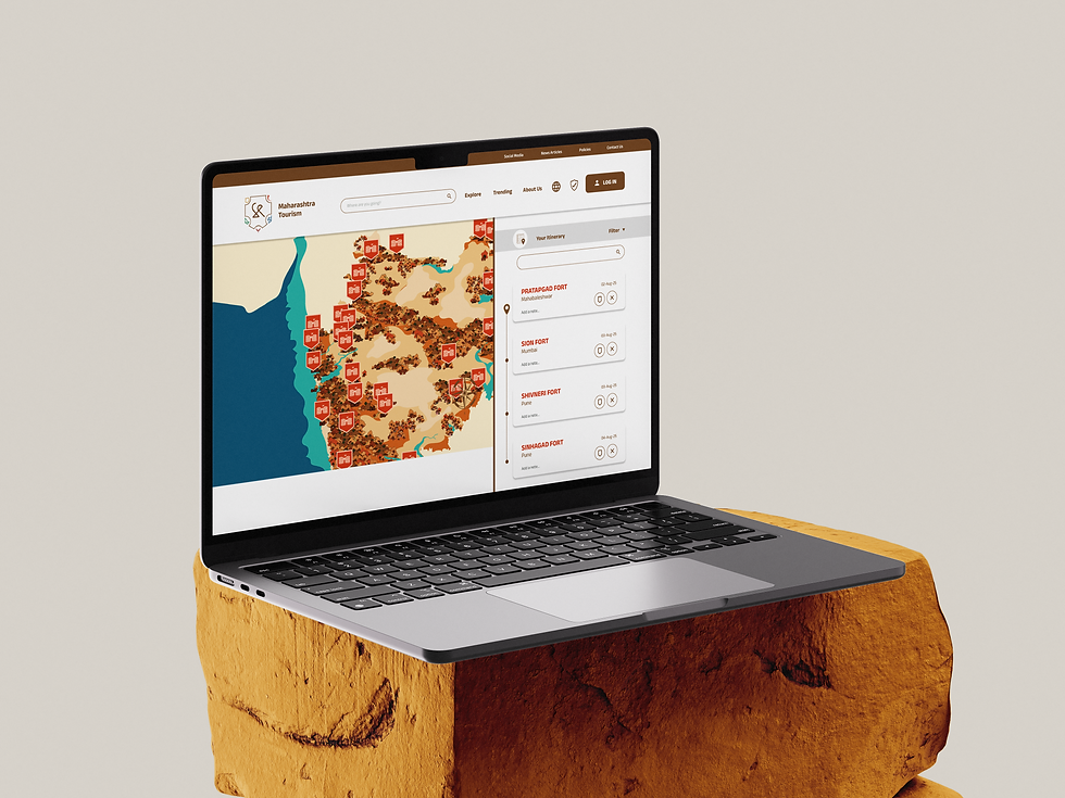
The website lacks planning tools, interactive maps as well as easy website navigation that makes the whole user experience a little overwhelming and confusing.
No User Testimonials and customer reviews:
Lack of user experiences and reviews makes it less trust worthy needs a separate source of confirmation.
No Itineraries or Customization:
Lack of pre designed or even customizable (personalized) itineraries makes it difficult to find the perfect tour plan for individual needs.
Lack of Safety and Accessibility Information:
There is no easy access to important safety information, permits for high-risk activities, and accessibility details for solo travelers.
Lack of Tour guides and safety guidelines:
Well trained tour guides help in navigating throughout the journey making it less stressful and reliable.
No interactive planning tools:
These things can reasonably be expected since other maps like Bing maps or route planners have these functions missing.
Complex navigation of website:
The website does not provide good filters that can help users look for family-friendly or comfort-based travel options easily.
Limitation in Experience Prioritization:
Users have no idea the experience they should try first (especially in destinations like Mumbai), since they did not have curated recommendations or guides to follow.

.jpg)


-2.png)
-1.png)
.png)
.png)

MAP DESIGN
The Map design should be able to communicate necessary information keeping in consideration the clarity of information and effectiveness of communication along with the ease of usability. It should be structured considering the fact that the users have limited time to spend on searching for information and it might get overwhelming to search for information in shorted time span. Incorporating interactive elements will enhance user engagement. In the context of Maharashtra Tourism, highlighting key factors in the spectrum of each category will help in seamless navigation and user flow.
-01.png)
History & Heritage
Nature & Adventure
-01.png)
Urban & Cosmopolitan
-01.png)
People & Hospitality
-01.png)
Cuisine & Food Culture
-01.png)
Districts & Cities


BRANDING
The branding is based on the 5 major categories (spectrums of Maharashtra), incorporating all the elements representing each category and Maharashtra as a whole.
-28.png)
Logos
_25.png)
Flagship Logo
The logo is a brand element of Directorate of Tourism Maharashtra. It represents the 5 main spectrums of Maharashtra i.e. History and Heritage, Cuisine and Food Culture, Nature and Adventure, Urban and Cosmopolitan nature, People and Hospitality. While the outer form takes inspiration from historical scrolls.
-25.png)
History & Heritage
This logo represents the History and Heritage Maharashtra. It takes inspiration from the form of tutari and ‘saraswati yantra’ (dusshera) elements and Maharashtra’s ‘म’ stays constant.
-25.png)
Cuisine & Food Culture
This logo represents the Cuisine and Food culture of Maharashtra. It takes inspiration from the form of ‘Modak’ and Maharashtra’s ‘म’ stays constant.
-25.png)
Nature & Adventure
This logo represents the Nature and Adventure in Maharashtra. It takes inspiration from mountains and seawaters and Maharashtra’s ‘म’ stays constant.
%20on%20bg-25.png)
People & Hospitality
This logo represents the Hospitality and People of Maharashtra. It takes inspiration from the ‘diya’ used in ‘aarti' a traditional gesture of welcome and Maharashtra’s ‘म’ stays constant.

Urban & Cosmopolitan
This logo represents the Urban and Cosmopolitan culture of Maharashtra. It takes inspiration from the ‘Bandra-Worli Sealink’ as a symbol of urban Maharashtra and Maharashtra’s ‘म’ stays constant.
-32.png)
-32.png)
Color Palette
The color palette was derived from the mood board that was constructed around each spectrum of Maharashtra individually and the colours derived represents each part i.e. history and heritage, cuisine and food culture, nature and adventure, people and hospitality and Urban and cosmopolitan culture respectively.
Low Fidelity Wireframes


Mid Fidelity Wireframes



ILLUSTRATIONS
& ICONS
Illustrations depicting visuals for each category as well as creating a visual representation of a warm and welcoming nature as a glimpse of Maharashtra.


.png)